|
<< Click to Display Table of Contents >> Setting up Windows |
  
|
|
<< Click to Display Table of Contents >> Setting up Windows |
|
The following topic provides an introduction to the set up of Windows in 3d-DigPlus. Windows are set up and controlled via the Window Appearance dialog. The Window Appearance dialog box contains 10 pages and controls a large number of parameters and settings. Many of these parameters and settings are self-explanatory or common to other software packages. This topic covers those parameters and settings which are unique to 3d-DigPlus.
3d-DigPlus supports the following window types:
Frame. Frame Windows display various wireframe views of a surface. Either a triangulation or grid model must be present for a surface to be visible in a Frame window. The following Frame types are supported:
Grid. The Grid frame type presents East and North gridlines as a three-dimensional wireframe model.

Grid Frame Window Type.
Contours. The Contour frame type allows the surface to be contoured and three-dimensional contours are displayed in the window.

Contour Frame Window Type.
Triangles. The Triangle frame type displays a surfaces triangulation as a mesh of wireframe triangles. A triangulated model must be present for a surface in order to use this frame type.

Triangle Frame Window Type.
Rendering. The Rendered window type displays a solid rendered view of the surface model. Either a triangulated or gridded model must be present.

Rendered Window Type.
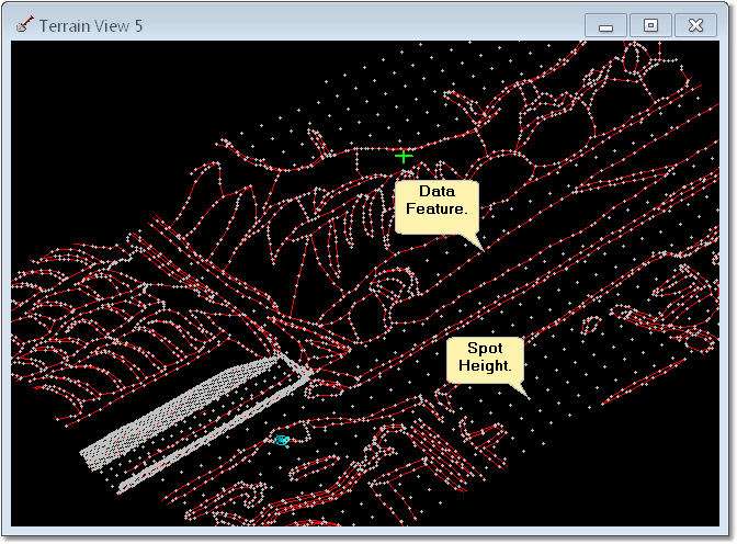
Data
The Data Window type displays the raw data from which the surface model is constructed. This includes Data Features and Spot Height points. Raw data for a Surface must exist in order to use the Data Window type.
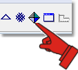
The Window Appearance dialog is used to create new Windows and modify existing Windows.
To open the Window Appearance dialog click on the Window Appearance toolbar button:
 Key Information - window specific settings.
The Window Appearance dialog contains a large number of settings that control the appearance and behaviour of design elements in Terrain Windows. As these settings are window specific it is possible to have design elements which appear in one window but not in another, and elements which are selectable in one window but not in another. If an expected element does not appear in window, or if an element appears but is not selectable, make the window active then open the Window appearance dialog and check the appropriate settings as described below.
General Page
The Window Appearance dialog starts with the General page displayed:
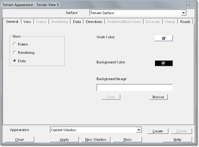
The General page contains the following elements:
Show Group. The Show Group contains three radio buttons titled Frame Rendering and Data. These radio buttons control which window type will be produced (as described above). When a particular type is selected the relevant following pages of the Window Appearance dialog become active.
Work Colour Selector. The Work Colour Selector allows a colour to be selected which will be applied to vector work elements generated by 3d-DigPlus when various functions are activated within the window. The default colour is wide and this is adequate for most purposes.
Background Colour Selector. The Background Colour Selector allows a colour to be selected which will be applied to the window background in situations where the topography does not fill the entire window.
Background Image. A background image may be loaded and will be displayed as a background in lieu of the background colour.
Appearance Pulldown List and Appearance Create Button. These elements appear at the bottom and are part of the Window Appearance dialog, they are present when any page is selected. Once a particular Window Appearance is set up it can either be applied to the active window, used to create a new window or it can be saved using the Appearance Create Button. Saving a particular appearance set up allows the set up to be retrieved and reapplied to a new window. To maintain consistency in the work environment and with any captured images, it is important that window setups do not change on an ad hoc basis throughout the design. If a particular window is accidentally deleted its settings can be recreated in a new window if the Appearance has been saved. Any saved Appearances will appear in the Appearance Pulldown List. Selecting the desired Appearance from the list and then clicking the New Window button will create a new window with the same Appearance settings as the original.
View Page
The View page contains elements which control the size of the physical window and its behaviour as well is the viewpoint. These settings are mostly used together with the Saved Window Appearance to allow a particular window type to be saved and retrieved should the original window be deleted.
The View page contains the following elements:
Window Resize Group. This Group contains three radio buttons which control the way the contents of the window change if the windows size is modified by the user. The options are:
Fit to window. When the window is resized the contents remain the same as in the original window with their scaling modified to accommodate the new window dimensions. This is the default setting.
Centre view. When the window is resize with this option that part of the topography which was previously at the centre of the window remains at the centre of the new window, the contents are not scaled.
Fix view. When the window is resized with this option to view position and scale remain static, the window plus acts as a viewport to a larger image.
View Direction Group. The View Direction Group consists of two editable fields which control the direction and azimuth of the viewpoint.
Window Size Group. The Window Size Group contains two editable fields that set the width and height of the window.
Frame Page
The Frame page contains settings which control the three frame type Windows (Contour Grid and Triangles). At the top of the Frame page is the Frame Type pulldown list. This list contains the three frame types Contour, Grid and Triangles.The elements on the Frame page vary depending on which Frame Type is selected. Each frame type is described separately below.

Frame Page - Contour Mode.
The Contour Frame page contains the following elements:
The Contour Parameters Group contains the following elements:
Based On pulldown. The Based On Pulldown has two options, Grid and Triangulation. This pulldown determines whether or not the contours will be based on the triangulated will grid model. As simulation takes place on the grid model this is the default option and the one which is most typically used. If contours are based on triangulation they will not reflect any simulation conducted.
Show Height Scale checkbox. A Height Scale maybe optionally displayed which provides a legend identifying what elevation is associated with major contours. This scale lists the colours of major contours and their associated elevations.
Label Contours checkbox. Selecting this option labels the major contours (elevation labels). If the Label Contours option is selected the associated group becomes enabled which allows the user control over contour annotation.
Colouring Group. Contours may either be a single colour (Mono Colour) or colour-coded for height (Height Colours). The Colouring Group contains two radio buttons which allow the colouring type to be selected. If Mono Colour is selected all contours have the same colour, colour can be chosen using the Minor Contours Colour selector. If Height Colours is selected the Set Heights & Colours button is enabled. When the Set Heights & Colours button is clicked the Height Colours dialog is produced:
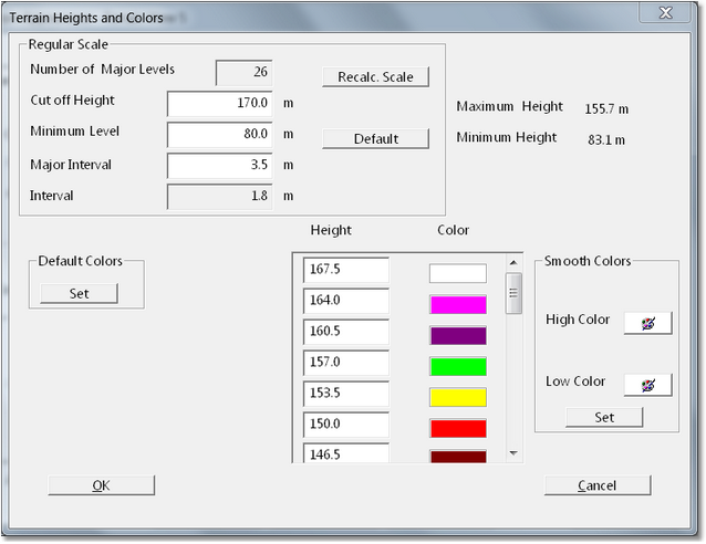
Height Colours dialog contains the following elements:
Regular Scale Group. The Regular Scale Group contains various parameters control the way the contours are colour-coded for height (elevation). The parameters are:
Cut off Height. This is the height (elevation) to which the contours extend, no contours above this elevation will be displayed.
Minimum Level. This is the lowest level (elevation) to which contours will extend. No contours below this elevation will be displayed.
Major Interval. This is the elevation interval at which coloured contours will be produced. For example: if the interval is set to 5.0 m a coloured contour will be produced at five meter intervals.
Recalc Scale button. Once the above parameters are set the Recalc Scale button must be pressed to implement these changes.
Height/Colours group. Once the parameters have been set and the scale recalculated the Height/Colours group lists all major interval contours and the colours applied to them. The colours can be modified by clicking on the colour selector and adjusting the colour using a palette.
Default Colours button. clicking the Default Colours button will restore the default colours.
Smooth Colours group. The Default colours are set up to ensure a distinct change of colour from one contour to the next. The Smooth Colours group of allows the user to colour the contours based on smooth rather than distinct colour transitions. The High and Low colour selectors allow the user to select the colour for the lowest and highest contours. Clicking the Set button in this group will then generate a series of smoothly transition Colours between these two.
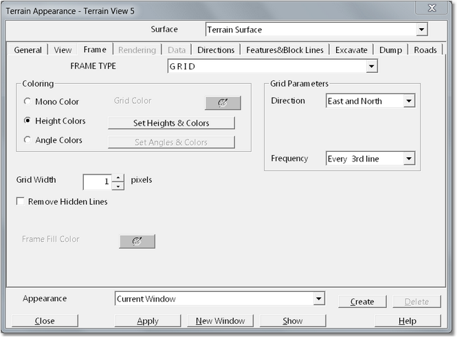
Colouring Group. Grid frames can be colour-coded for elevation in a similar manner to contours. The Grid Colouring Group is generally the same as the colouring group for contours as described above.
The Grid Colouring Group contains an additional option, Angle Colours. the Angle Colours option allows the grid to be colour-coded according to the slope of the surface at each point on the grid. This colour coding allows steep and low gradient areas of the topography to be readily identified. It is typically used in association with the Environmental Reshaping module to ensure that regraded topography conforms to design criteria. When the Angle Colours option is selected the adjacent Set Angles and Colours button becomes enabled. Clicking the Set Angles and Colours button produces the Slope Colours dialog. The Slope Colours dialog is very similar to the Height Colours dialog described above and is set up in a similar manner. The Slope Specific portions of this dialog are displayed below:
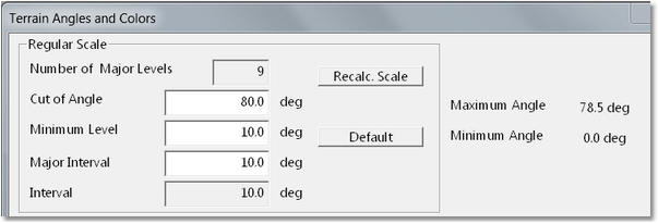
The angle colour coding is set up in the same manner as height colour coding described above.
Grid Parameters Group. The Grid Parameters Group consists of two pulldown lists which control which grid elements are displayed.
The Direction pulldown includes three options, East and North, East Only and North Only. The East and North option results in gridlines running in both East and North direction being displayed. The East Only option displays only grid lines running in an east-west direction, and West Only displays only gridlines running in a north-south direction.
The Frequency group controls the frequency at which the gridlines are displayed. This can vary between every gridline and every 20th line.
Grid Width Field. The Grid Widths Field controls the width of the displayed gridlines.
Remove Hidden Lines checkbox. When selected this checkbox results in hidden line removal in the grid display. Display and refresh times are increased slightly with this option.
the Rendering Page contains settings that control the way solid rendered views are displayed.
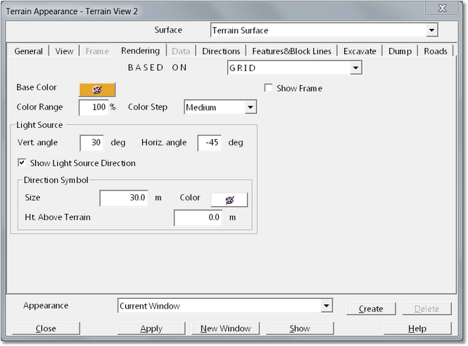
Rendering page contains the following elements:
Based On pulldown list. Based On pulldown list contains two options, Grid and Triangulation. This pulldown determines whether the rendered view is based on the triangulation or grid model. As simulation takes place on the grid model this is the default setting and one that is typically used.
Base Colour selector. The Base Colour selector allows the user to select the basic colour used for rendering the terrain.
Colour Range field. Using the Base Colour the system renders the topography by applying a range of shades from dark to light. The Colour Range field determines the colours at the two ends of the spectrum used to create the rendition. It can be used to prevent portions of the topography being either too light or too dark.
Colour Step pulldown list. The Colour Step pulldown list has three options, Coarse, Medium and Fine. It controls the number of colours used to render the topography. Find setting produces the best rendition but results in a slightly longer refresh time.
Show Frame checkbox. If the Show Frame checkbox is checked an east and north frame superimposed on the rendered view.
Light Source Group. The Light Source Group controls the direction of the light source used to illuminate the topography. It contains the following elements:
Vertical Angle. This is the angle between a vertical line and the light source. Higher Vertical Angle settings result in a darker rendition.
Horizontal Angle. This is a direction, measured from north, of the light source. varying this parameter may be necessary if parts of the topography have a washed out appearance.
Show Light Source Direction checkbox. When selected this checkbox results in an arrow being placed on the topography to indicate light source direction. The appearance of this arrow is controlled by the Direction Symbol settings.
The data page contains settings which control the appearance of Data Features and Data Points in a window displaying data.
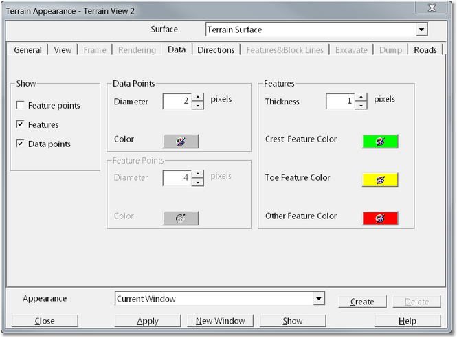
The Data Page has four groups:
Show Group. The Show Group contains three checkboxes which control all the elements which are displayed within the window. The options are:
•Feature points. Selecting this option will display point markers where vertices exist on the feature.
•Features. Selecting Features displays Data Feature lines.
•Data points. The Data points option displays markers wherever data points exist.
Data points group. This group allows the size and colour of the markers modified.
Features Group. This allows the size, colour and thickness of feature lines to be modified. 3d-DigPlus allows for three types of data features categorised and coloured independently. This feature categorisation is only the purpose of allowing the user organise different types of data features, is not affected triangulate surface model.
The Directions page contains three groups which control various elements indicate direction and position on the terrain surface in all window types.
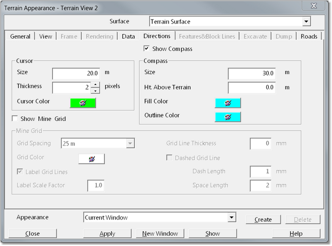
The three groups are:
Cursor Group. All Windows contain an object known as the Terrain Cursor. The Terrain Cursor can be selected and moved by the user, while the Terrain Cursor is selected its position (E,N & RL) and the distance from its previous position appear in the status bar. The Cursor Group settings allow the size, thickness and colour of the Terrain Cursor to be modified.
Compass Group. The Compass rose appears in all Terrain Windows to indicate North direction. Settings in the Show Compass Group allow the size and colour of the compass rose to be modified. Checkbox also allows display of the compass rose switched on and off.
Mine Grid Group. A grid running in the east and north direction can optionally be displayed on the terrain. Settings in Mine Grid group allow display of the grid to be selected and the frequency of gridlines modified.
Features and Block Lines Page.
Features and Block lines page contains four groups which control display of Surface Features, Section Features (cross-sections) and Block lines.
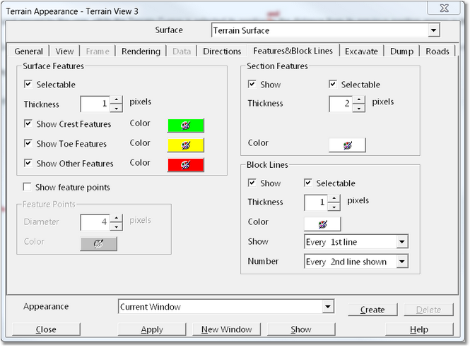
The four groups are:
Surface Features Group.Surface Features Group contains settings which control the selectability, line thickness, and colour of Surface Features.3d-DigPlus allows for three types of Surface features and these can be coloured and display independently.
Feature Points Group. Feature Points Group contains settings which control display of markers on vertices of surface features.
Section Features Group. The Section Features Group contains settings which control the selectability, line thickness, and colour of Section Features. Section Features are feature lines associated with cross sections and longitudinal sections.
Block Lines Group. Where Block Lines have been set up for an excavation, these may optionally be displayed in a Terrain Window. The Block Lines group contains settings that control the appearance, thickness, colour and frequency of block lines.
The Excavate Page contains settings that control the display of excavation design elements.
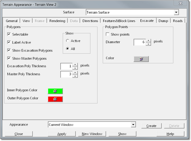
The Excavate Page contains the following elements:
Polygons Group.
The Polygons Group contains a series of elements that control the appearance of Excavation Polygons. These elements are:
Selectable checkbox. If this checkbox is selected Excavation Polygons can be selected and edited in the Terrain Window. If this checkbox is not selected Excavation Polygons do not respond to point and click selection.
Label Active. If multiple Excavation Templates exist in the design file, Excavation Polygons associated with all these Templates visible in the Terrain Window. Only that Excavation Polygon associated with the Active Excavation Template will respond to Start Excavation command. When Label Active is selected Active symbols will appear on the Active Polygon.
Show Excavation Polygons. When creating Excavation Polygons it is essential that these elements appear in the Terrain Window. However when performing subsequent operations (excavation, dumping happens and simulation) is often desirable to have the display of these elements switched off to improve the quality of animation. When Show Excavation Polygons is selected these elements will appear in the Terrain Window, when it is deselected they will not appear.

Tip - Display of excavation polygons
In order to construct excavations it is necessary that excavation polygons are displayed in at least one Terrain Window. However excavation polygons can create clutter if they appear in the final animation. Maintain one window for construction purposes with the display of excavation polygons selected, and maintain a second window to capture images for animation with the display of excavation polygons disabled.
Show Master Polygons. This checkbox performs in the same manner as the Show Excavation Polygons but applies to Master Polygons. Master Polygons were implemented in the early development of 3d-DigPlus and are not commonly used in current versions.
Inner & Outer Polygon Colour Selectors. These colours selectors allow the user to choose the colour used to display the Inner & Outer Polygons.
Show Group. This group contains two radio buttons Active and All. By default the All radio button is selected and all Polygons associated with all Excavation Templates will be displayed. When the Active option is selected only the polygons associated with the Active Excavation Template will be displayed. The Active option is frequently the best option as the Terrain Window can become cluttered if many Excavation Templates are present.
Excavation & Master Polygon Thickness Fields. These fields allow a line weight to be selected which controls the thickness of the displayed Polygons.
Polygon Points Group. This group contains elements which control the display of polygon vertices. By default the display of polygon vertices is switched off.
The dump page contains settings that control the display of dump elements.
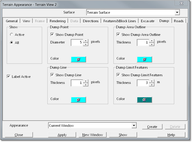
The Dump Page contains the following elements:
Show Group. This Group contains two radio buttons Active and, All. When a design file contains multiple Dump Templates many dump elements (Point,Line or Area) may be present. When the All option is selected all these dump elements will appear on the Terrain Surface. When the Active option is selected only those elements associated with the Active Dump Template will appear.
Label Active checkbox. When the Label Active checkbox is selected the dump elements (Point, Line or Area) associated with a Active Dump Template will be labelled with a symbol to indicate that they are active.
Dump Element Groups. There are four Dump Element Groups: Dump Point, Dump Area Outline, Dump Line and Dump Limit Features. Each of these groups contains the following elements: Show checkbox. When this checkbox is selected the particular element type will appear on the Terrain Surface. Size/Thickness field. This group allows the user to input of value which determines either the size of the object or the line thickness. Colour selector. The Colour selector allows the user to choose the colour of the nominated Dump Element.
Tip - Display of dump elements
 In order to construct dumps it is necessary that various dump objects are displayed in at least one Terrain Window. However these dump objects can create clutter if they appear in the final animation. Maintain one window for construction purposes with the display of dump objects and selected, and maintain a second window to capture images for animation with the display of dump objects disabled.
The Roads page contains settings that control the display of road design elements.
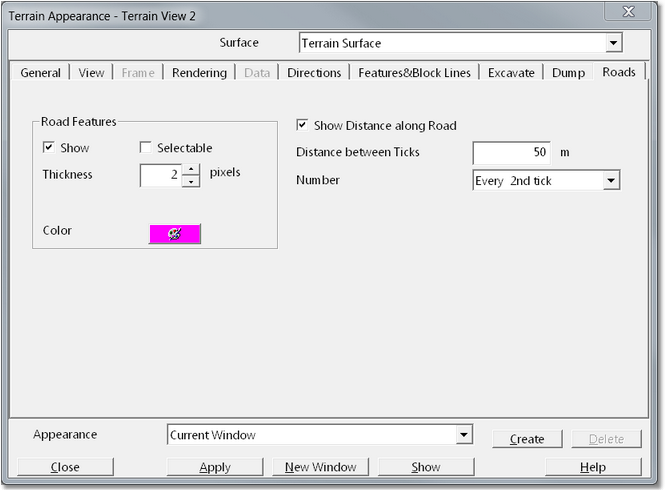
The Roads Page contains settings for the display of Roads on the Terrain Surface. These settings will only be available if the system has the Truck & Shovel Simulation module enabled.
The Roads page contains the following elements:
Road Features group. The roads appear on the Terrain Surface as a linear Feature element (similar to Surface Features). The Road Features Group contains the following items: Show Checkbox. When the Show Checkbox is selected Road Features appear on the Terrain Surface. Selectable checkbox. When the Selectable Checkbox is selected Road Features can be selected and edited in the Terrain Window. Thickness Field. The Thickness Field allows the user to enter a number which controls the line weight (thickness) of the Road Features. Colour selector. The Colour selector allows the user to select the colour of the Road Features.
Distance along Road Checkbox. When this Checkbox is selected the roads will be annotated with check marks indicating distance from start of Road.
Distance between Picks field. This field allows the user to input a distance which will control the frequency of the distance markers along the Road.
Number (Distance) pulldown list. This pulldown list allows the user to control how frequently the road distance pit marks are annotated.
It is important to understand that the settings described above are window specific. That is to say they apply to one particular window. For example, it is possible to have a window set up in which Surface Features appear and another in which they are not visible. It is also possible to have one window in which Surface Features appear and are selectable and another in which they appear but cannot be selected due to the settings for that window.
If a particular window does not display elements which you think should appear, or if the elements appear but not selectable the first step in resolving this problem should be to make this window active then open the Window Appearance Dialog and check the appropriate settings. If the settings are not as you expect, change the settings as required then click the Apply button. The window's behaviour should now be corrected. If however the settings are as you expected there is a possibility that the window may have been corrupted and is misbehaving. In this case create a new identical window using the New Window Toolbar Button:

Copy Window Toolbar Button.
The newly created window should behave correctly, delete the original window and use the new one.